In-Sight Photography Project Website Redesign
In-Sight Photography Project is a nonprofit organization that empowers youth through photography education. As their Visual Communication & Marketing Specialist (and previously, their AmeriCorps Marketing Associate), I led a full redesign of their outdated website to improve usability, better represent the organization’s mission, and serve the needs of students, parents, donors, and staff.
Design Process
-
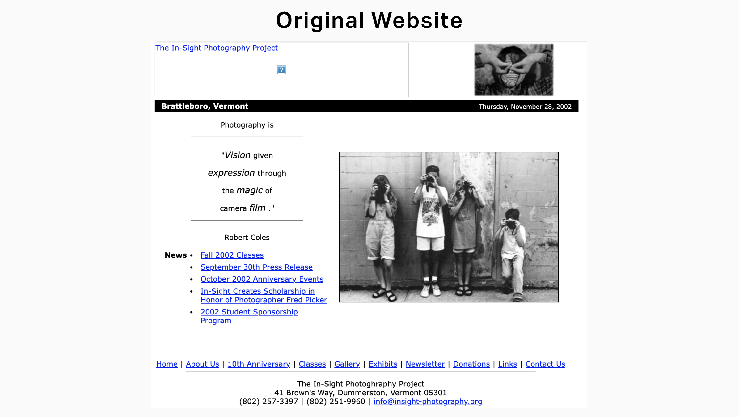
In-Sight’s original website was difficult to navigate, lacked clear calls to action, and did not reflect the creativity or inclusivity at the heart of their programming.
Key issues included:Disorganized site structure and unclear pathways to enroll, donate, or learn about classes
Inaccessible design and limited mobile responsiveness
Outdated visuals and messaging that no longer aligned with the brand’s growth
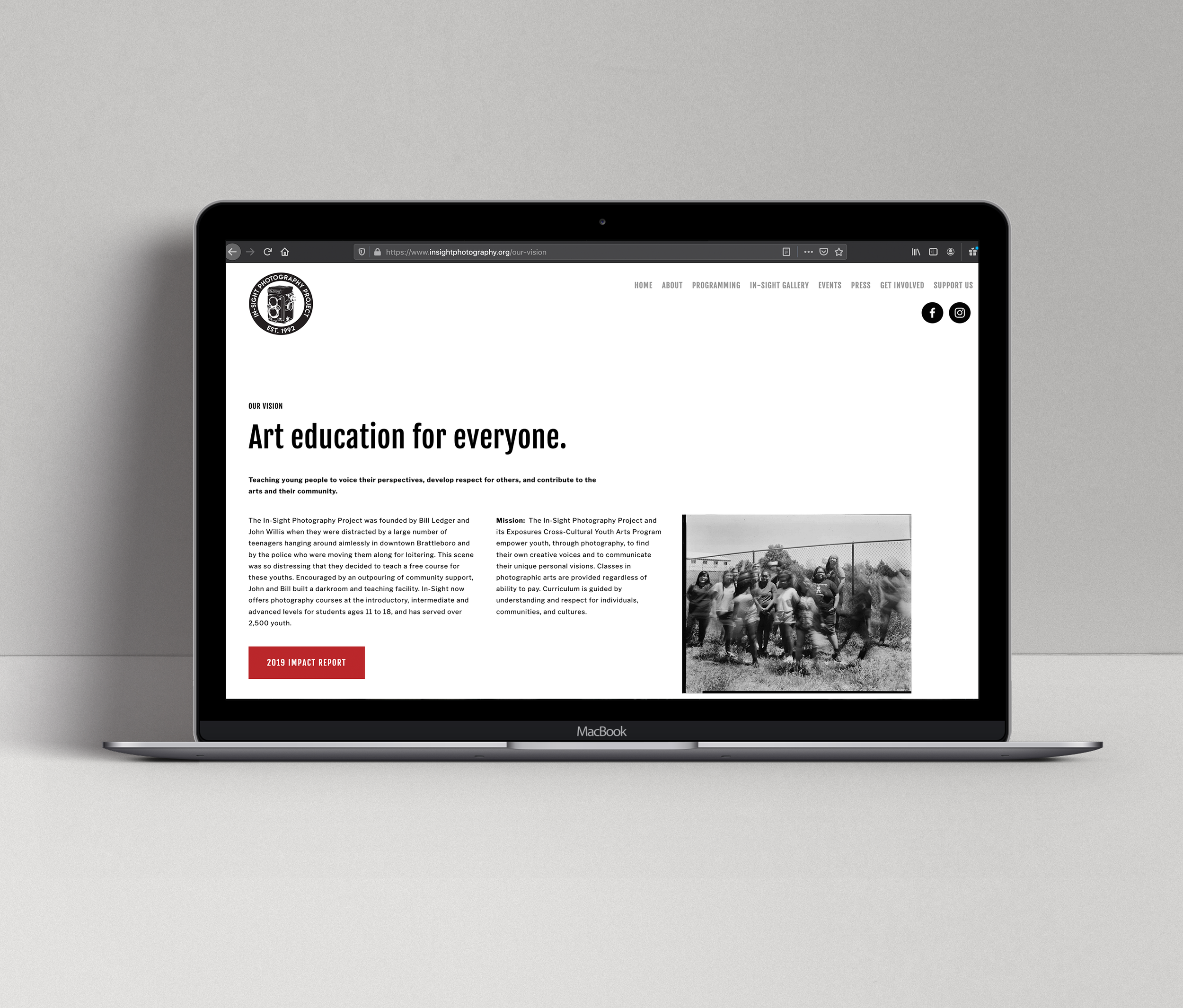
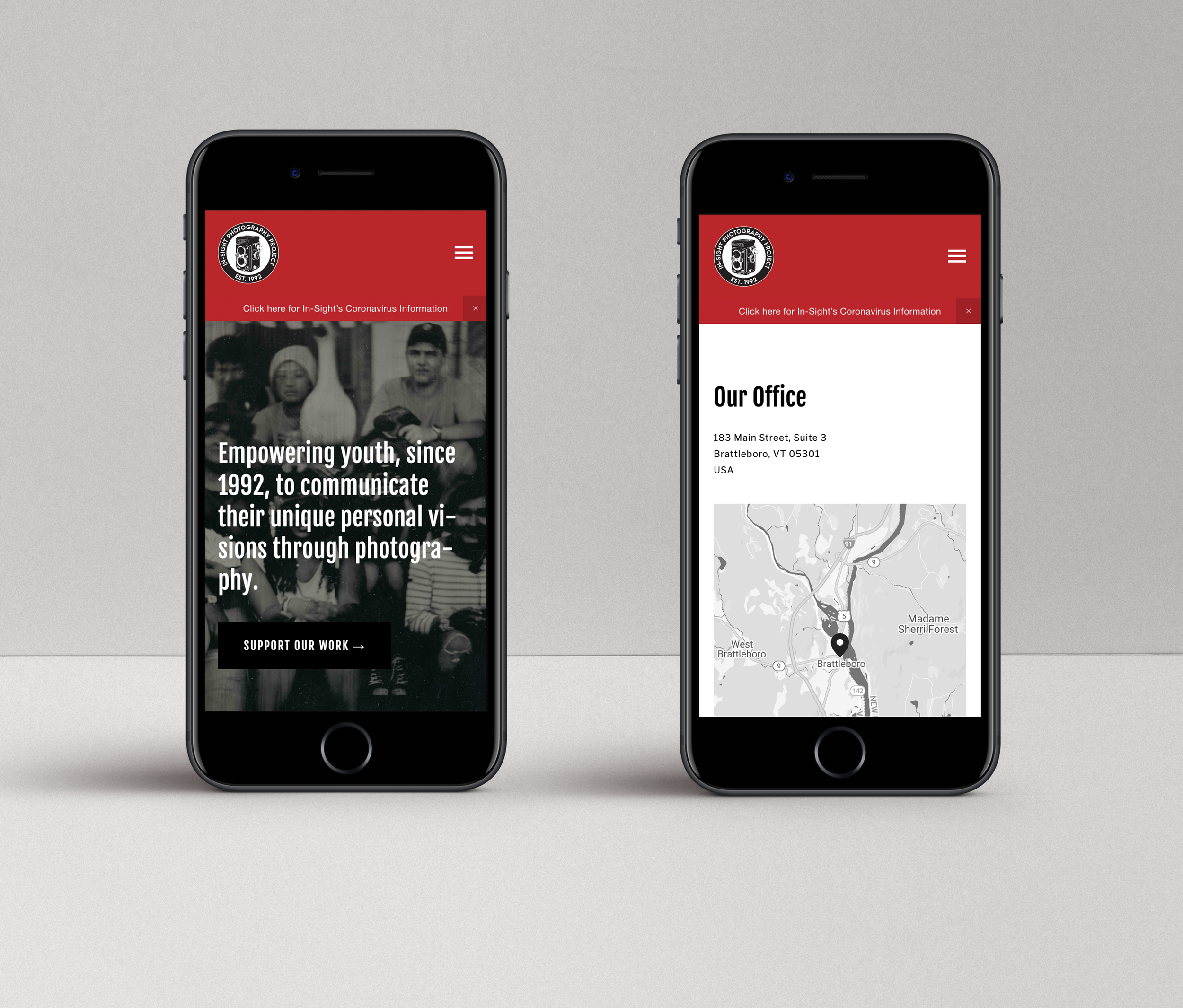
My goal was to create a website that was modern, clean, welcoming, and usable across devices, while making it easier for users to take action and engage.
-
I began by auditing the existing website and mapping out the main pain points through a combination of:
Staff and stakeholder interviews
User research via surveys to parents, students, and community members
A competitive analysis of other youth arts nonprofits
With insights in hand, I developed a new site architecture, prioritizing clarity, simplicity, and action-focused navigation. I wireframed key pages (like “Programs,” “Enroll,” and “Support”) to test layout ideas, then built out the site in Squarespace using a responsive theme.
Throughout the process, I:
Refined and rewrote web copy for clarity and inclusivity
Developed brand-aligned visual content including class imagery, student quotes, and banners
Implemented accessible design principles such as color contrast, alt text, and structured headings
Collaborated with staff to ensure the backend was manageable for non-technical users
-
The final website was a clean, mobile-responsive, user-friendly platform that better served In-Sight’s community. Key features included:
A reorganized navigation system with simplified categories
Clearly defined pathways for student enrollment, donor support, and community engagement
Dynamic visuals that showcased student work and celebrated In-Sight’s values
Integrated newsletter signup, donation tools, and a simple blog for program updates
-
The new website:
Increased online enrollments and newsletter signups
Made information more accessible
Reflected In-Sight’s mission and programs with authenticity and ease
Received positive feedback from community members, staff, and board members
-
This project deepened my skills in UX thinking, accessibility, and stakeholder collaboration. If I were to do it again, I would:
Include more structured user testing before and after launch
Explore multi-language content options more deeply
Set up long-term tracking metrics for engagement and conversions
It also solidified my passion for building tools that connect people to education, creativity, and community.