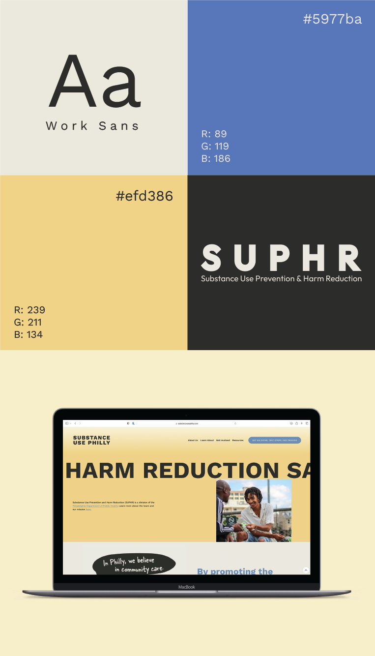
Philadelphia Department of Public Health: Substance Use and Harm Reduction (SUPHR) Division Rebrand
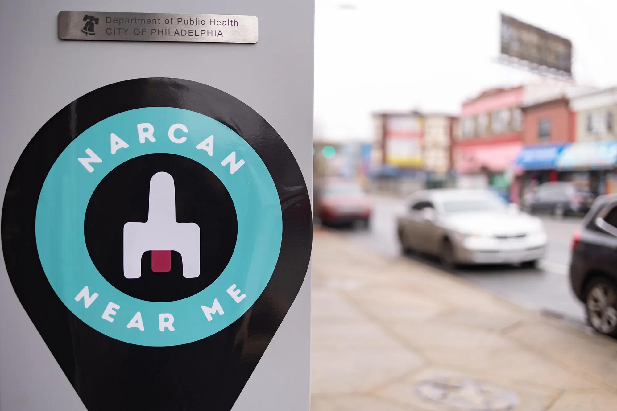
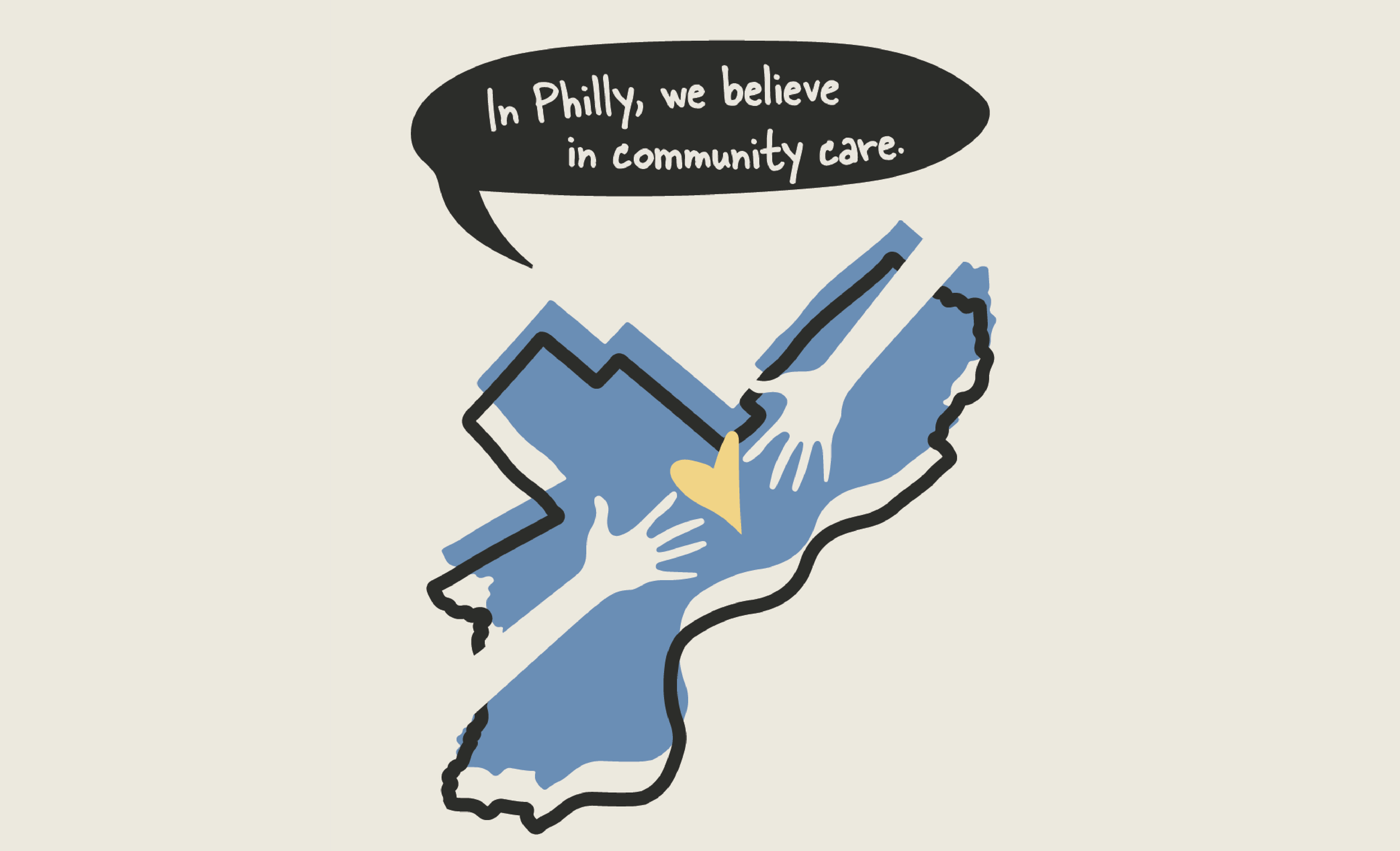
During my time with the Substance Use Prevention and Harm Reduction division, I led a full rebrand that centered on clarity, compassion, and the real needs of the people SUPHR serves. One of the core challenges was finding the right balance for the visual identity. As a government division, we needed to honor the City of Philadelphia’s established brand standards, including the blue and yellow palette, a clean sans serif typeface, and a consistent, structured design system. At the same time, many of the communities we serve have understandable reasons to distrust government institutions, so creating something that felt cold or overly official was never an option. I approached the work by listening closely to harm reduction leaders, community members, and our outreach team to understand what would feel welcoming, familiar, and grounded in care. The result was a visual identity that stayed within city guidelines while still feeling human and neighborly, a brand that reflected the people who make up this community and the dignity they deserve.
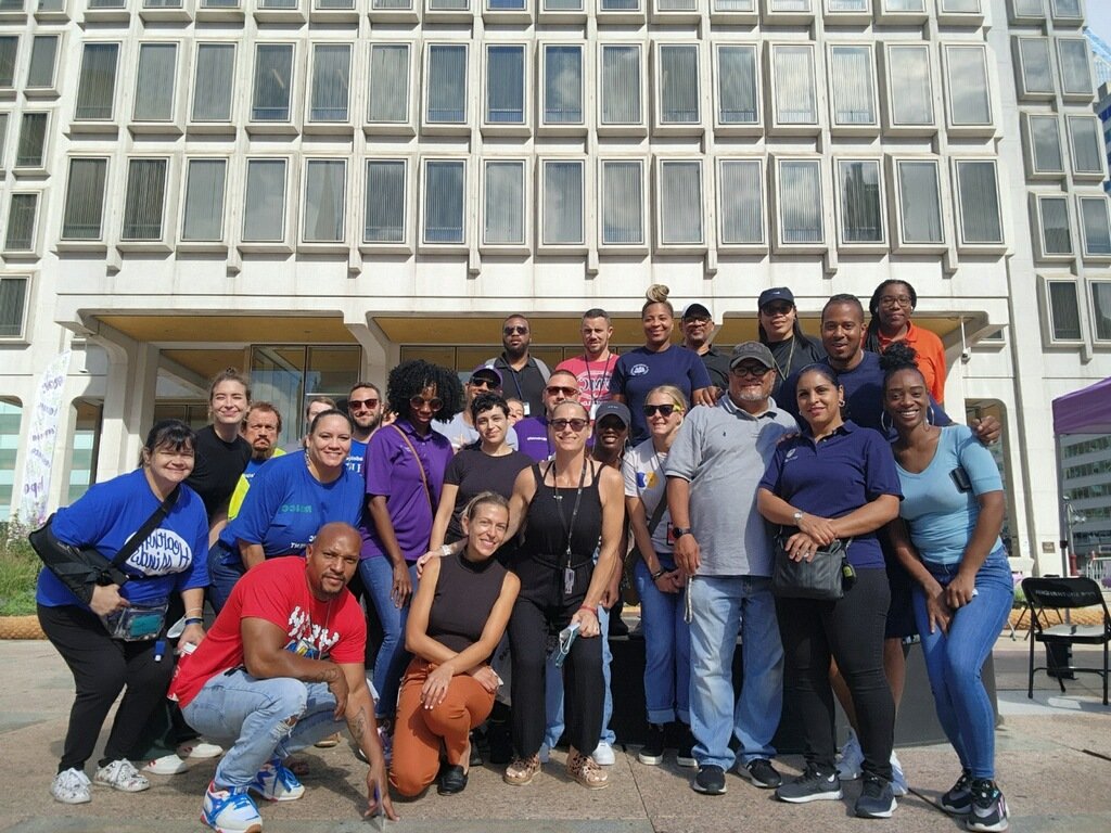
Designing SUPHR’s first dedicated division website became one of the most meaningful projects of my time there. SUPHR operates as the umbrella for nine distinct departments, each with essential information that must be easy to locate, understand, and trust. Our communications team was small, just two full-time staff members and two student workers, and I took on the full design and structure of the site. The goal was to create a true community hub for Philadelphians seeking harm reduction resources, while also serving as a dependable source of information for the entire tristate region. Because the people we serve have diverse accessibility needs and a wide range of literacy levels, the site had to feel intuitive, welcoming, and clear to every visitor. At the same time, medical professionals rely on SUPHR for up-to-date insights on the city’s drug supply, so the site also needed to support more technical and clinical use. Balancing all of these needs required a thoughtful approach, and every decision was made with dignity, clarity, and accessibility at the center.
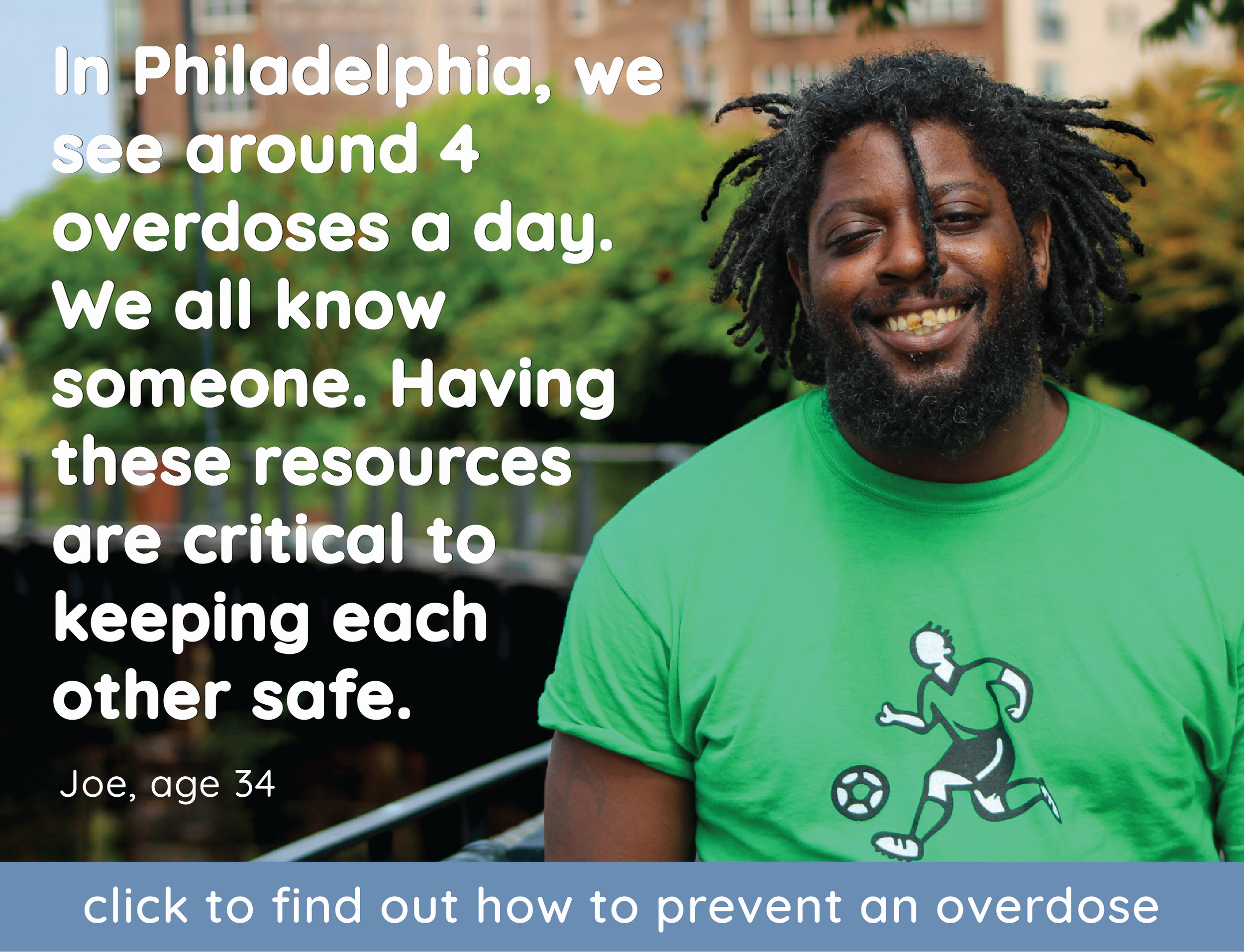
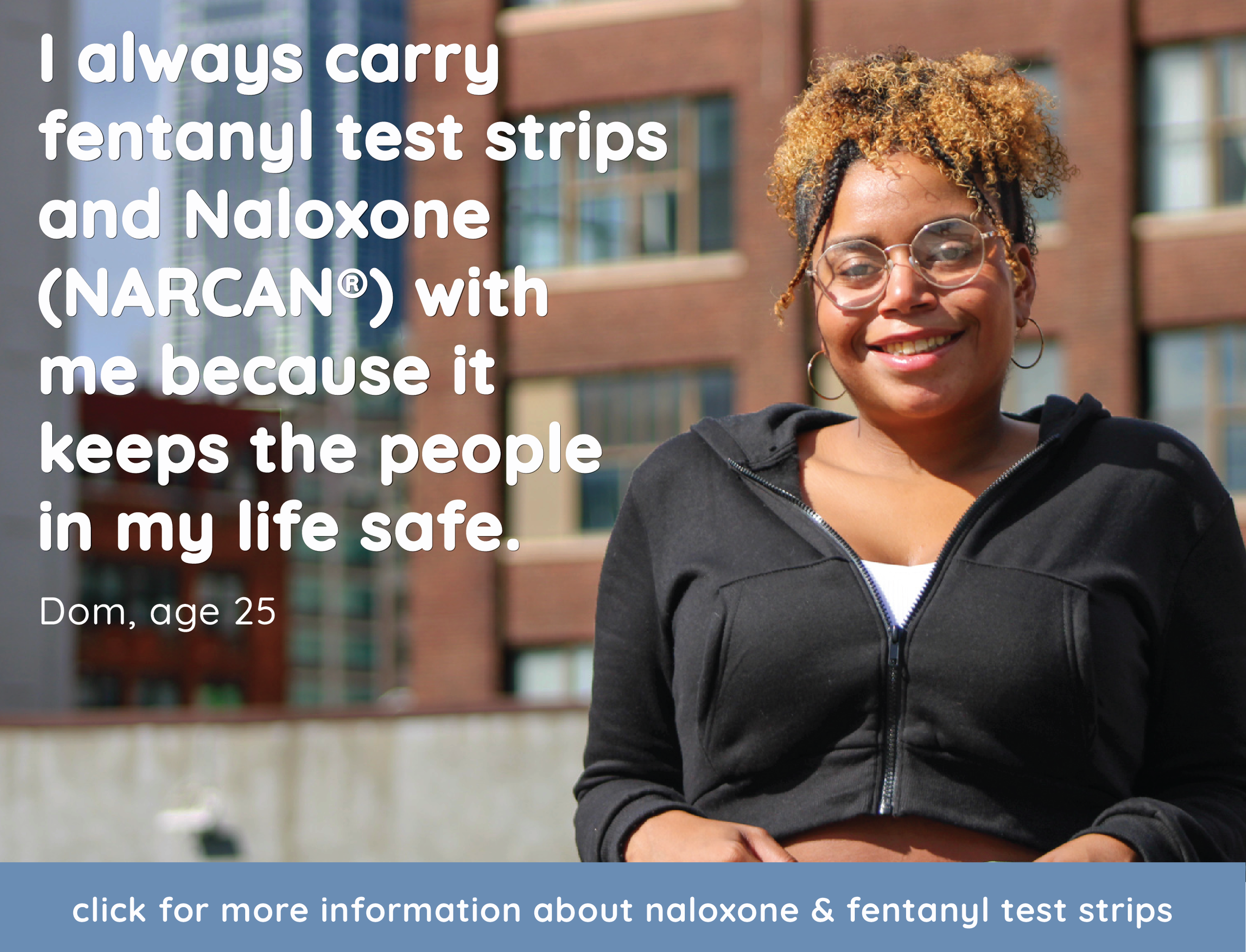
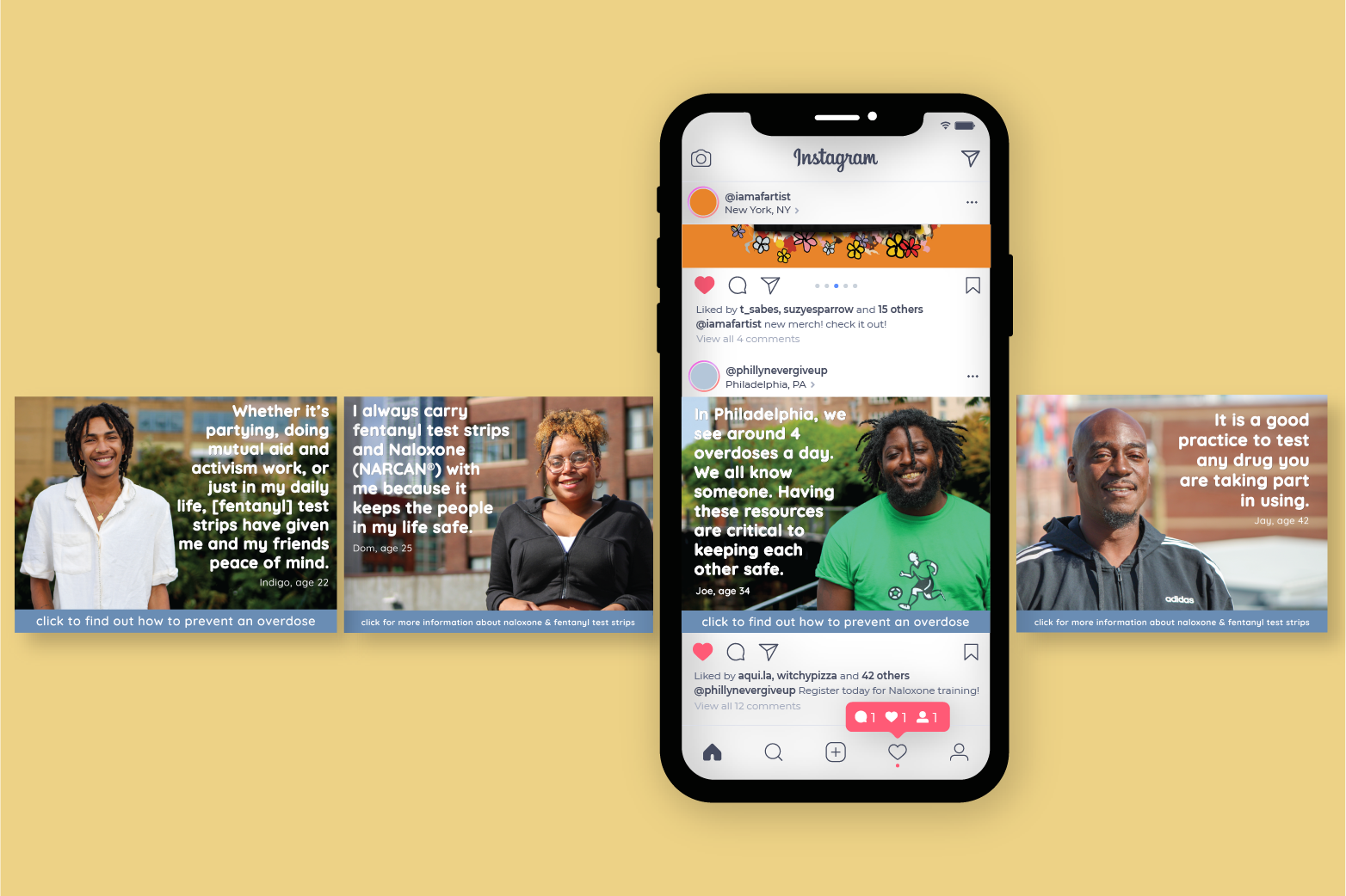
When it came to campaign work, I had a bit more creative room to move. Each Philadelphia neighborhood has its own personality and history, so designing neighborhood-specific materials became a way to show people that we truly saw them. I kept city brand colors in the mix, but through UX research, surveys, and ongoing feedback, I shaped designs that resonated with the communities receiving them. The materials needed to feel familiar, relevant, and rooted in local culture. The more people saw themselves in the work, the more they felt heard.
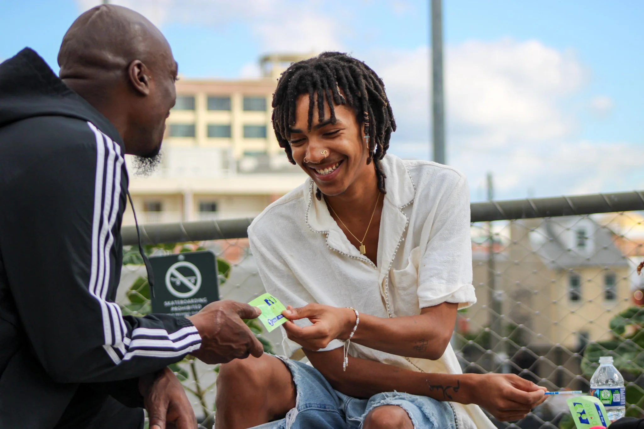
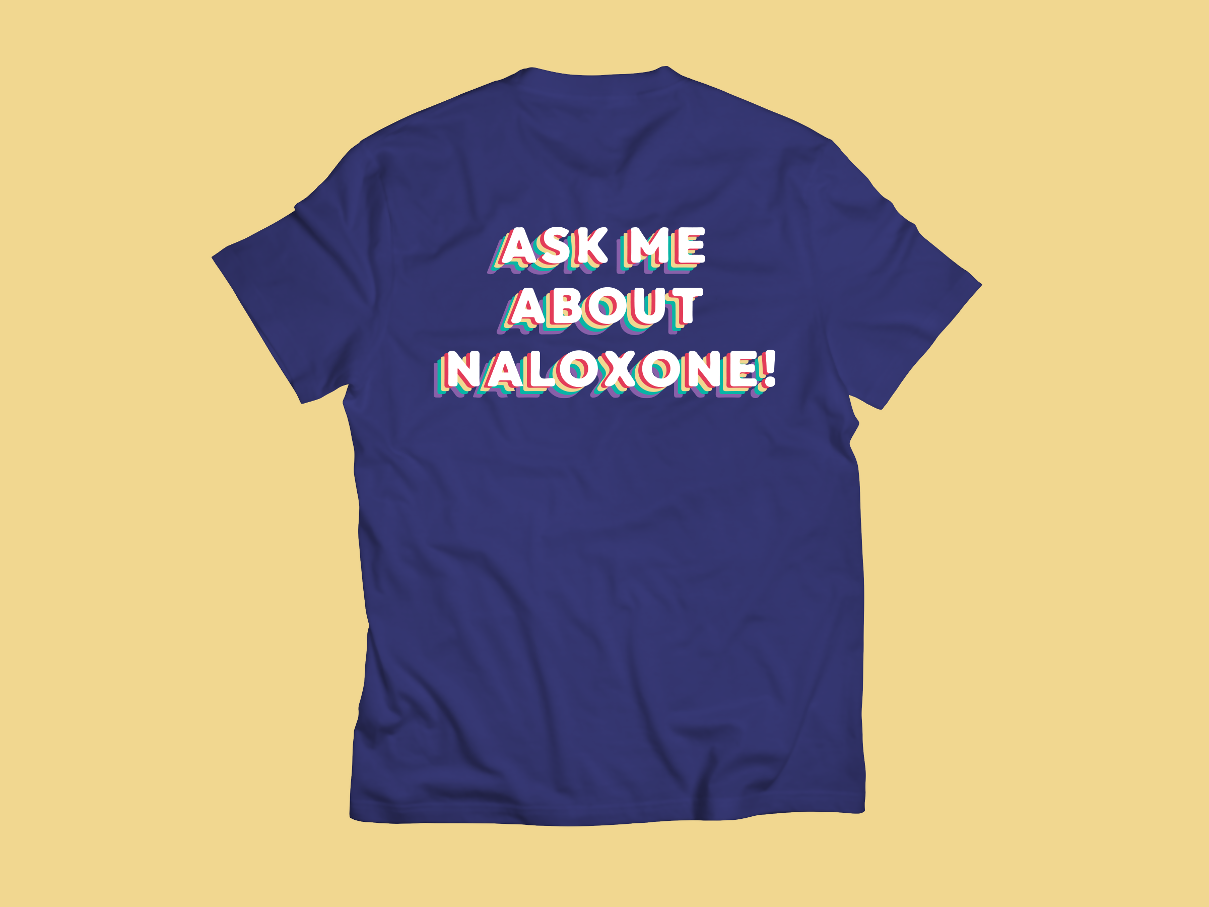
At the heart of SUPHR’s mission is ending drug stigma. This rebrand wasn’t about looking polished; it was about removing obstacles and creating a system where people could actually find what they needed. My role was to translate those values visually, and I did that by listening to what the community wanted, checking in constantly with our outreach team, and designing a system that truly felt like Philadelphia. The final branding was not just a set of colors or templates; it was a promise that the city sees people who use drugs as neighbors deserving of care, respect, and support.