In-Sight Photography Project Rebrand
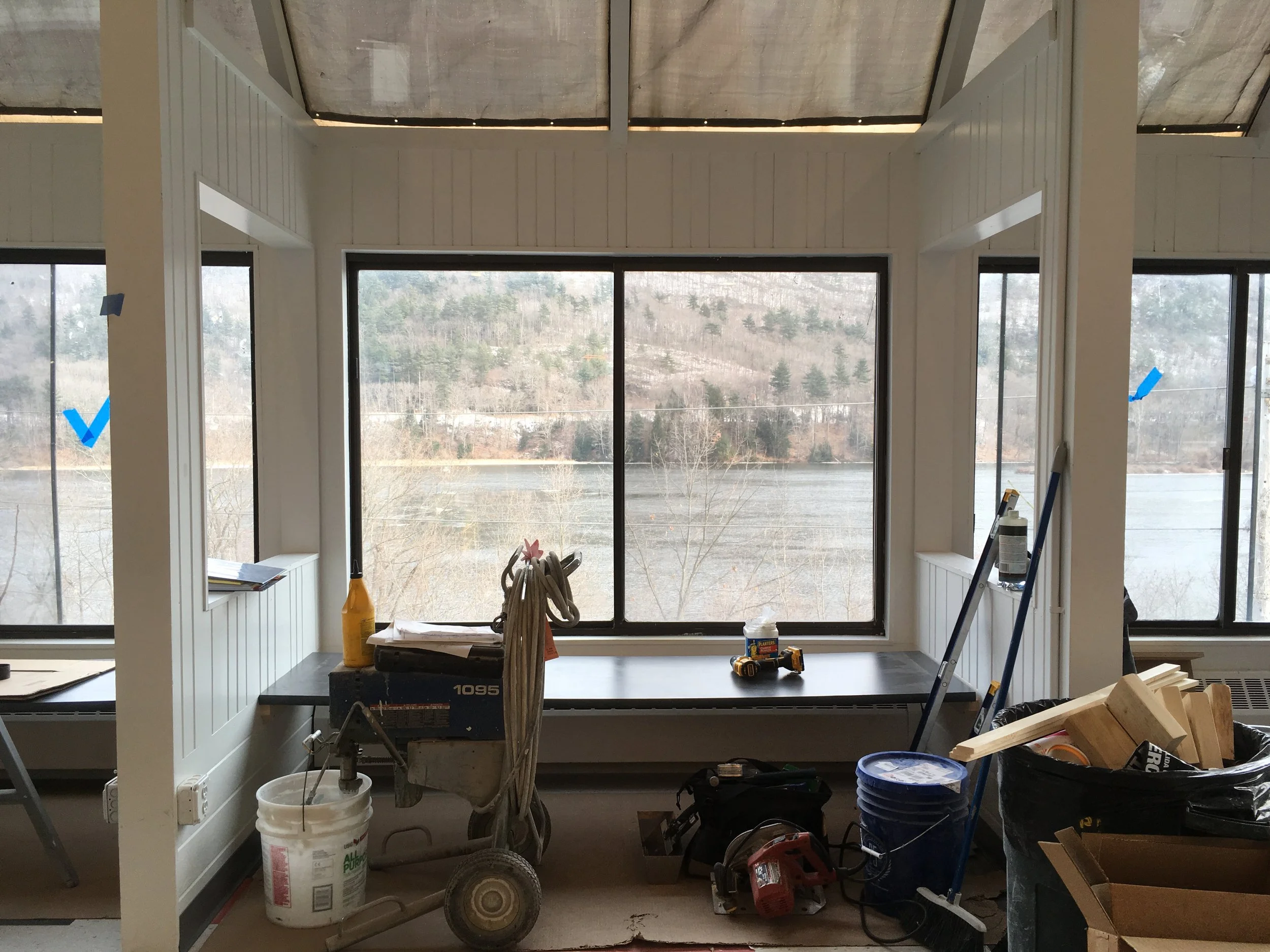
During my time at In-Sight Photography Project, I led a full organizational rebrand at a moment of major transition, not just for the organization but for the young people who relied on it as a creative home. We were moving from a tiny, beloved space down a back alley into a brand new, state of the art building right on Main Street. For a place like Brattleboro, where punk art history runs deep and the 90s still have a real grip on the town’s analog, make-it-yourself creative culture, this shift felt enormous. I knew from the start that the rebrand needed to hold all of that: the students who needed a space to be loud, messy, curious, and brave; the long-standing community that loved In-Sight’s gritty roots; and the donors who had invested in a polished new chapter.
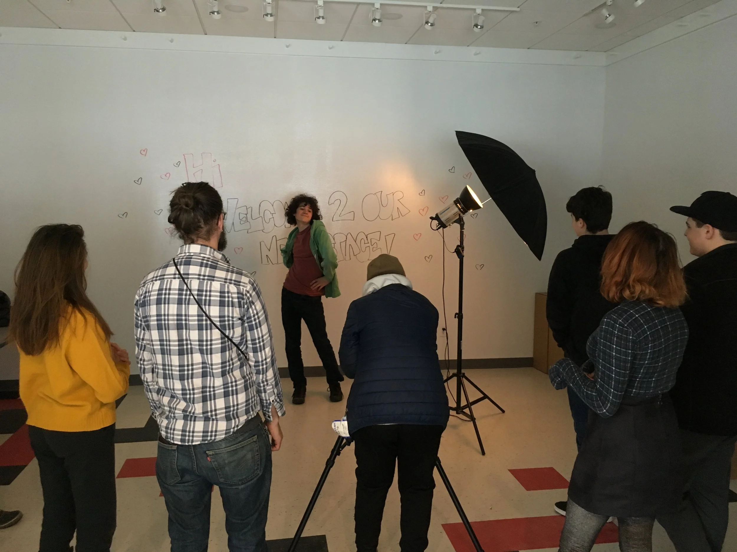
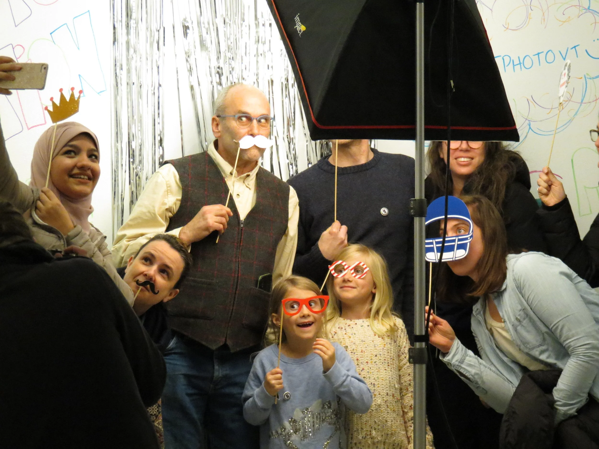
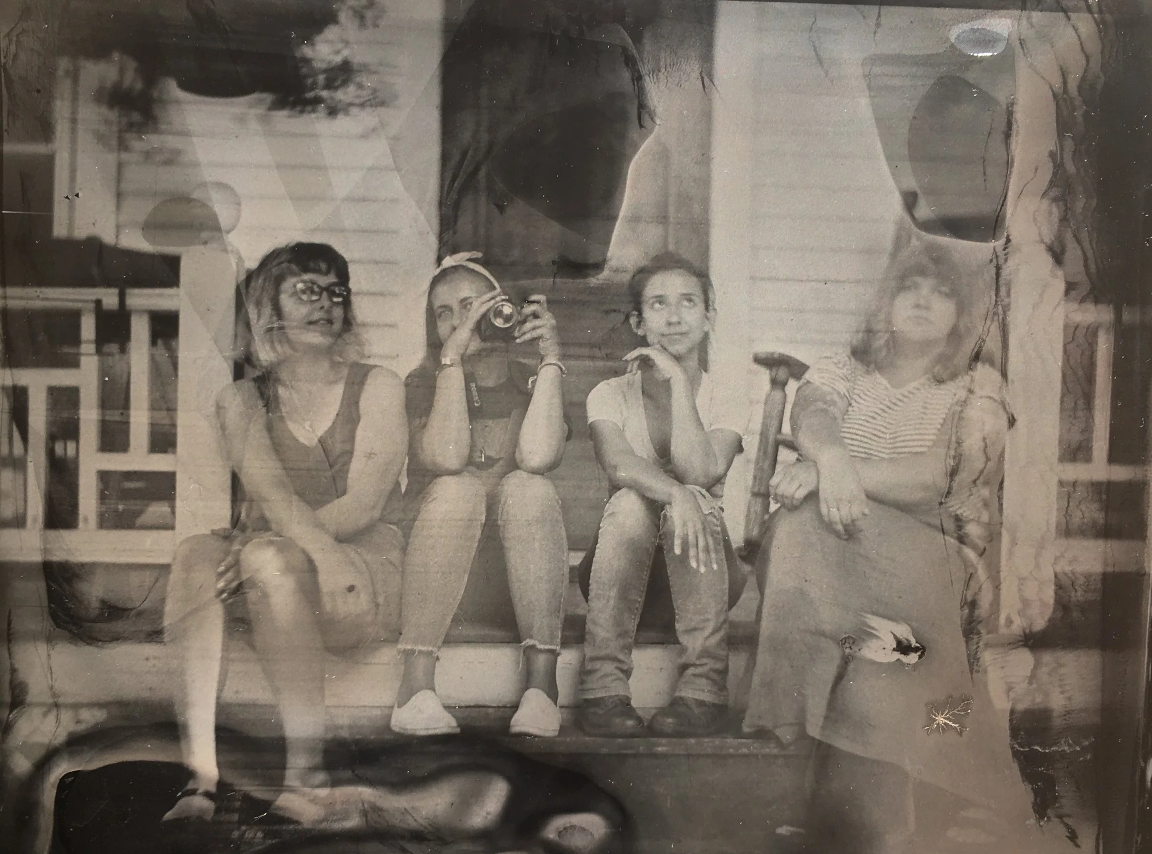
Keeping the students involved was one of my biggest priorities. I wanted them to feel ownership over the new identity, not like it was something shiny and unfamiliar being handed to them. So I built the visual language around play, texture, and physical materials, hand-drawn, imperfect, full of motion. Every illustrative element came directly from my own hands to preserve that analog, DIY energy that’s so central to In-Sight’s spirit. The marketing work leaned into that same philosophy: punk, tactile, and grounded in the real experience of developing photos in the darkroom.
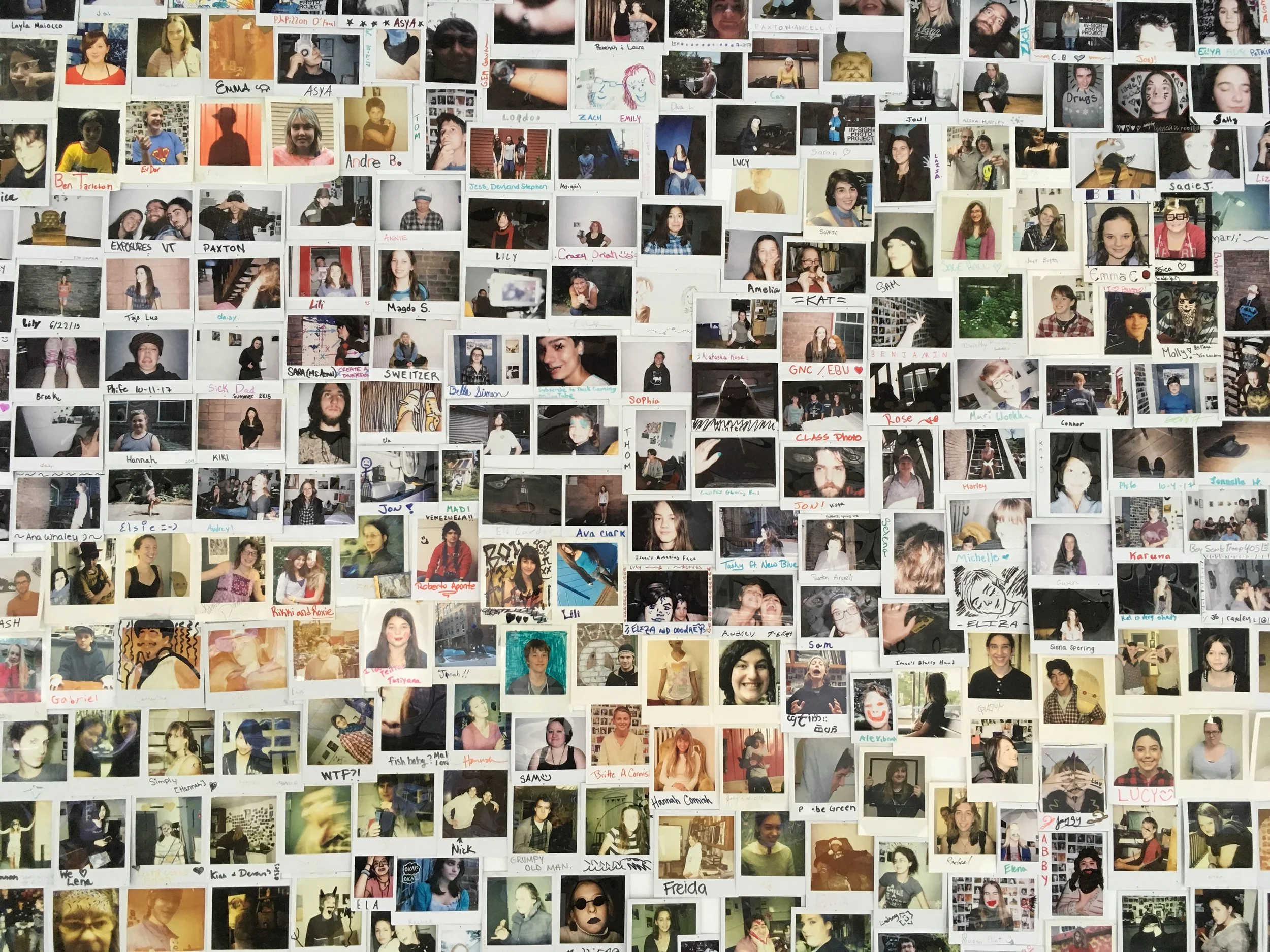
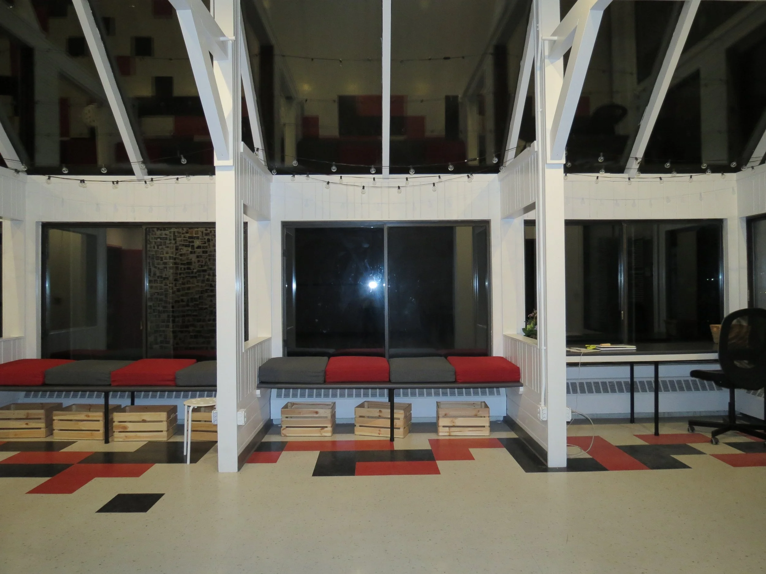
One of my favorite parts of the project was honoring the wall of Polaroids, hundreds of snapshots of every student and teacher who had passed through In-Sight. These photos had lived in boxes for years, but losing them in the move was never an option. I spent hours sorting through them, organizing them, and bringing them into the new space in a way that felt intentional and celebratory. It became a physical reminder that even as we stepped into a new, more public chapter, our roots were still right there with us.

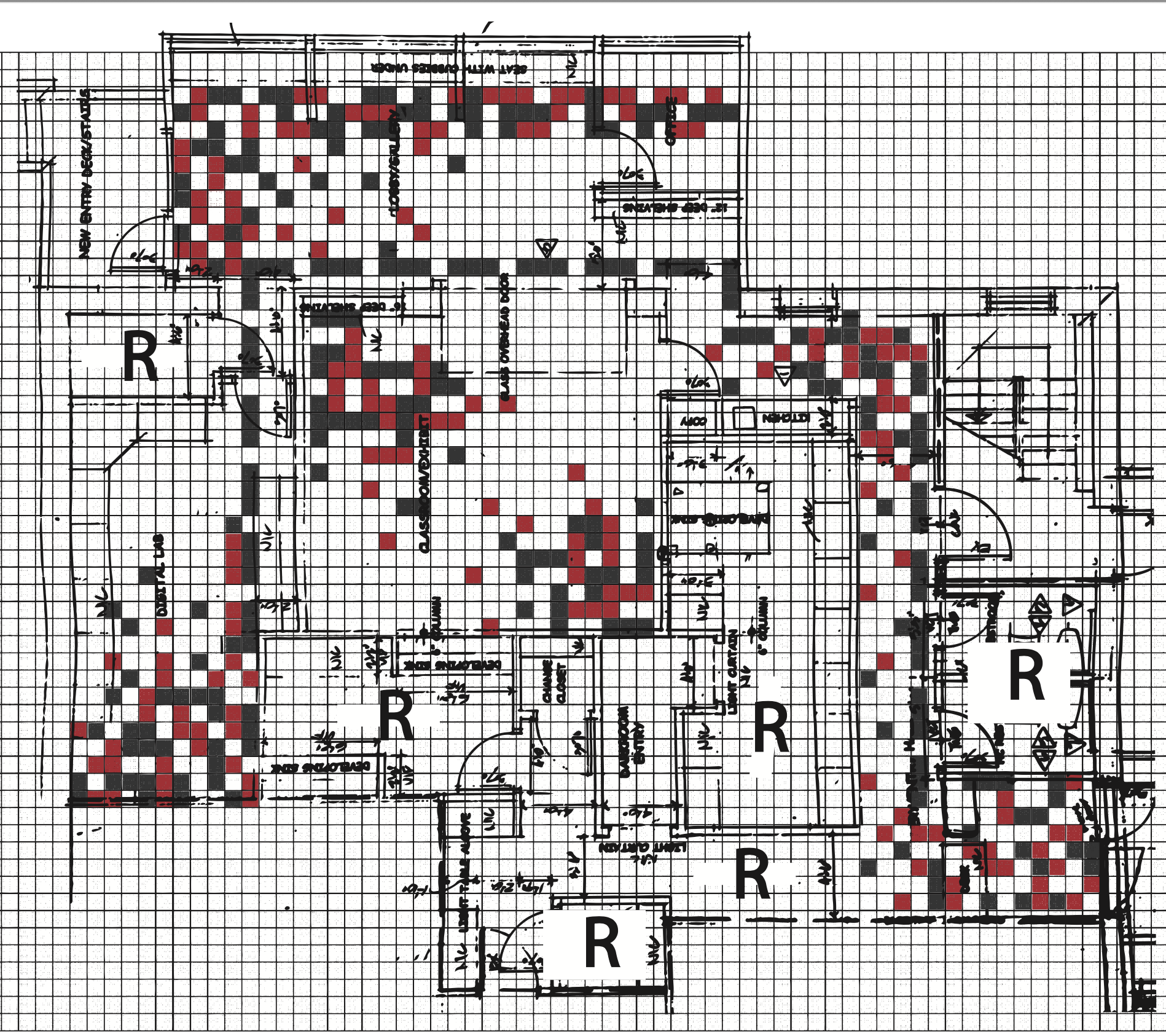
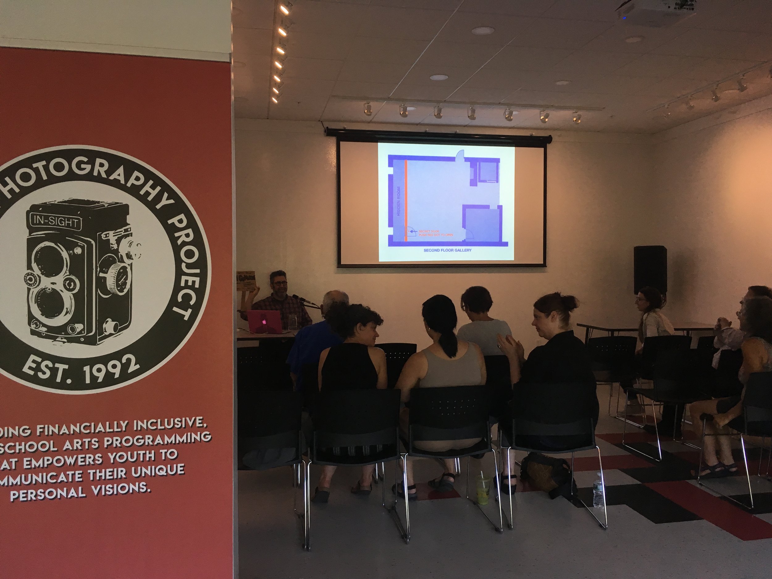
The move also gave me the chance to design the interior layout as a kind of visual wayfinding system. Because the space was so new and so much larger than what we had before, I wanted students, especially those coming in for the first time, to feel grounded as soon as they walked in. This was also my first time approaching ADA-compliant space design, and it became a huge learning experience. I thought deeply about accessibility, clarity, and flow, ensuring that every student, caregiver, volunteer, and community member could navigate the space with ease and dignity.
In the end, the rebrand was not just about a new logo or website; it was about weaving together old and new, gritty and polished, punk and professional. It was about making sure every young person felt like this new chapter still belonged to them. And honestly, shepherding that balance was one of the most meaningful design challenges I have ever taken on.