The First Book of Gardening
This project reimagines Virginia Kirkus’s First Book of Gardening, originally published in 1956, for a contemporary young audience. The original book, printed in black and white with limited visual appeal, felt unapproachable for the children it aimed to inspire. My redesign reframes the text through vibrant, accessible illustration and playful layout, creating a more inclusive and engaging reading experience rooted in curiosity, exploration, and connection to the natural world.
Design Process
-
A gardening guide designed for children should spark excitement, yet the original 1956 edition fell short:
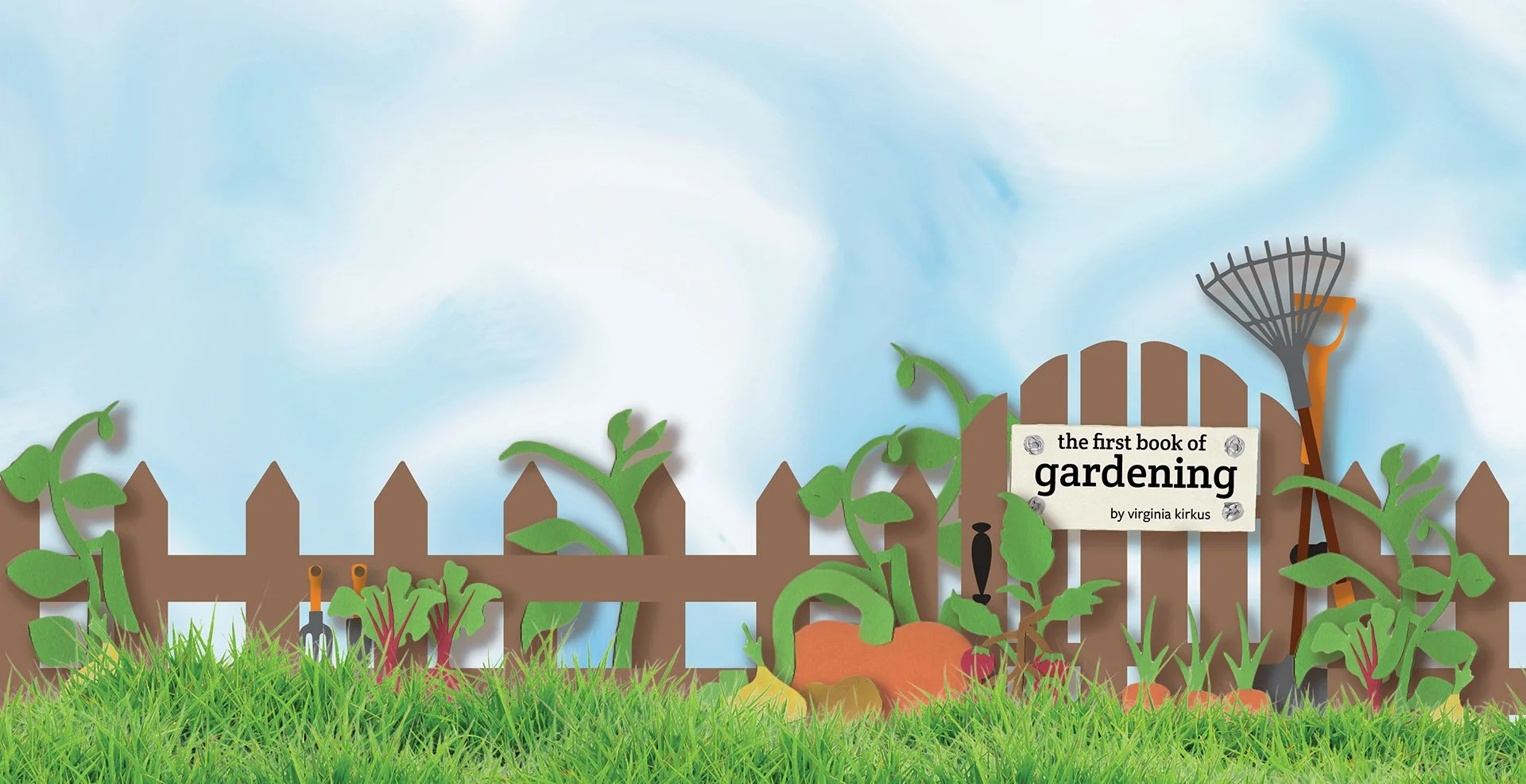
The monochrome illustrations lacked energy and relevance for modern readers.
Dense text and traditional page layouts made the content feel static and uninviting.
The book’s visual tone did not reflect the fun, tactile, imaginative qualities of gardening itself.
The challenge was to redesign the publication so children could see themselves in its pages — and feel invited to explore, learn, and play.
-
Visual Research & Illustration Exploration
Studied contemporary children’s book design, color psychology, and accessibility standards for young readers.
Developed a vibrant illustration system using multiple mediums:
digital illustration
cut and scanned paper shapes
hand-drawn linework
integrated photography of natural textures
Unified these approaches into a cohesive, colorful visual language.
Typography & Layout Redesign
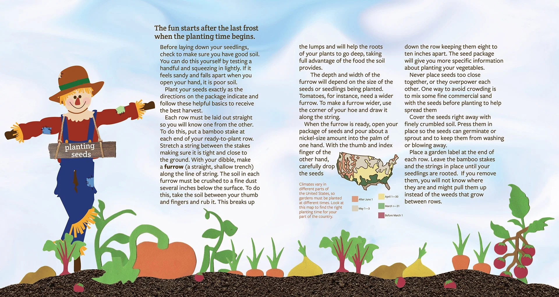
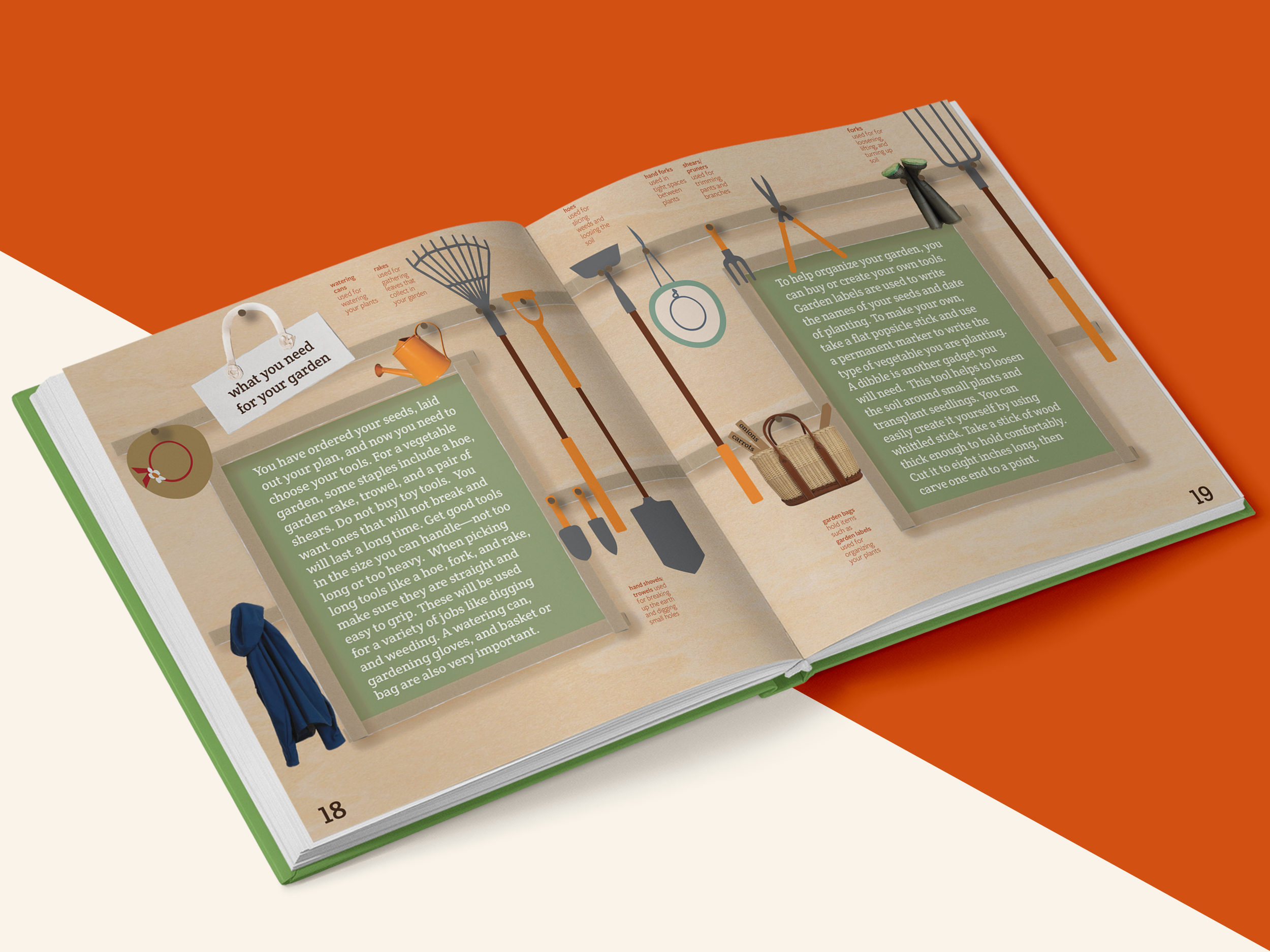
Replaced the original serif typeface with a modern, child-friendly sans serif to improve readability.
Introduced dynamic text placement to guide the reader’s eye and support comprehension.
Balanced illustration and text rhythm to keep each spread engaging without overwhelming the young reader.
Storytelling Through Visual Structure
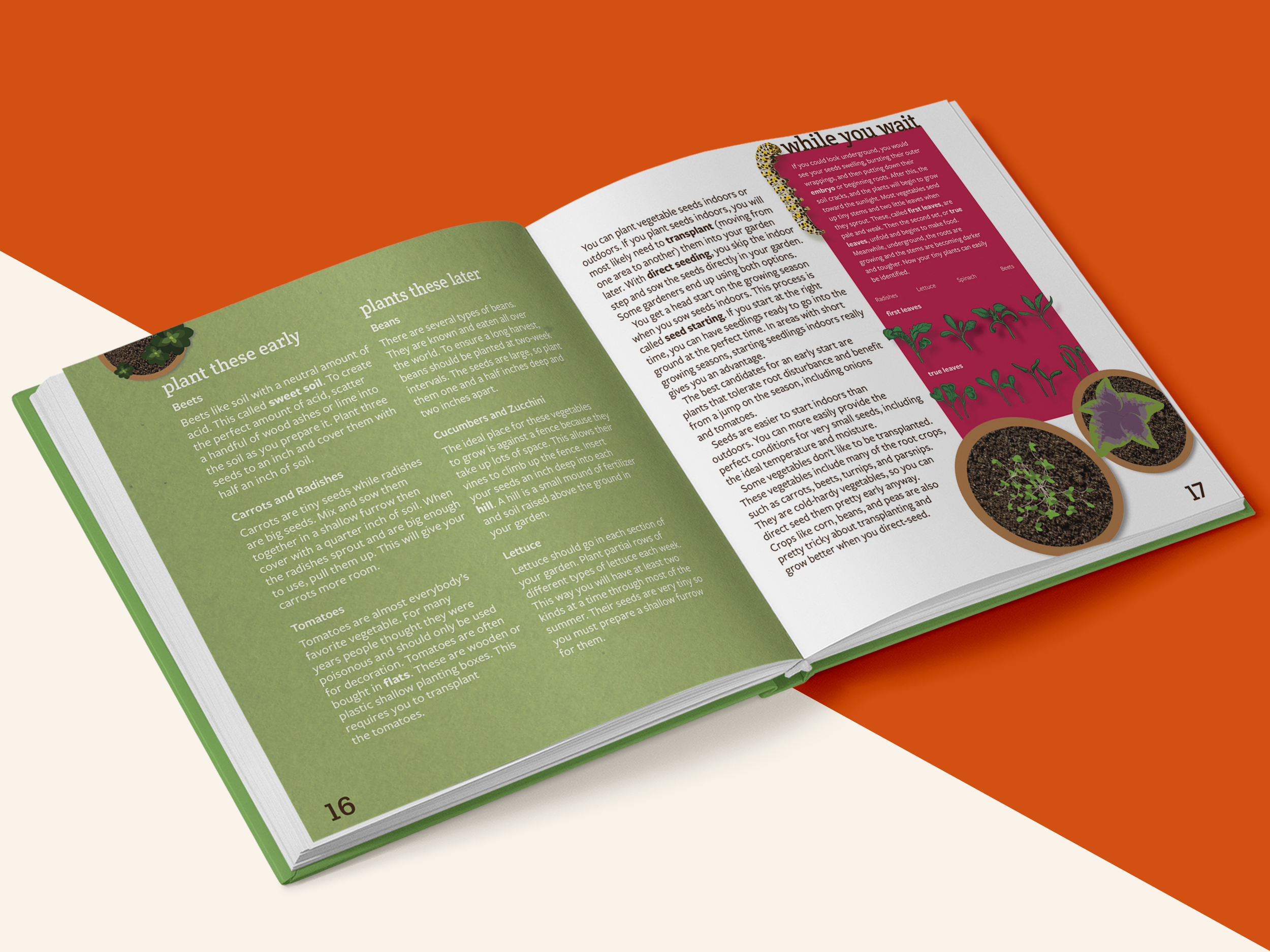
Ensured each illustration meaningfully supported the content—showing steps, concepts, and garden elements in an intuitive way.
Used color and layout to emphasize key ideas, create movement, and reinforce the joy and sensory richness of gardening.
-
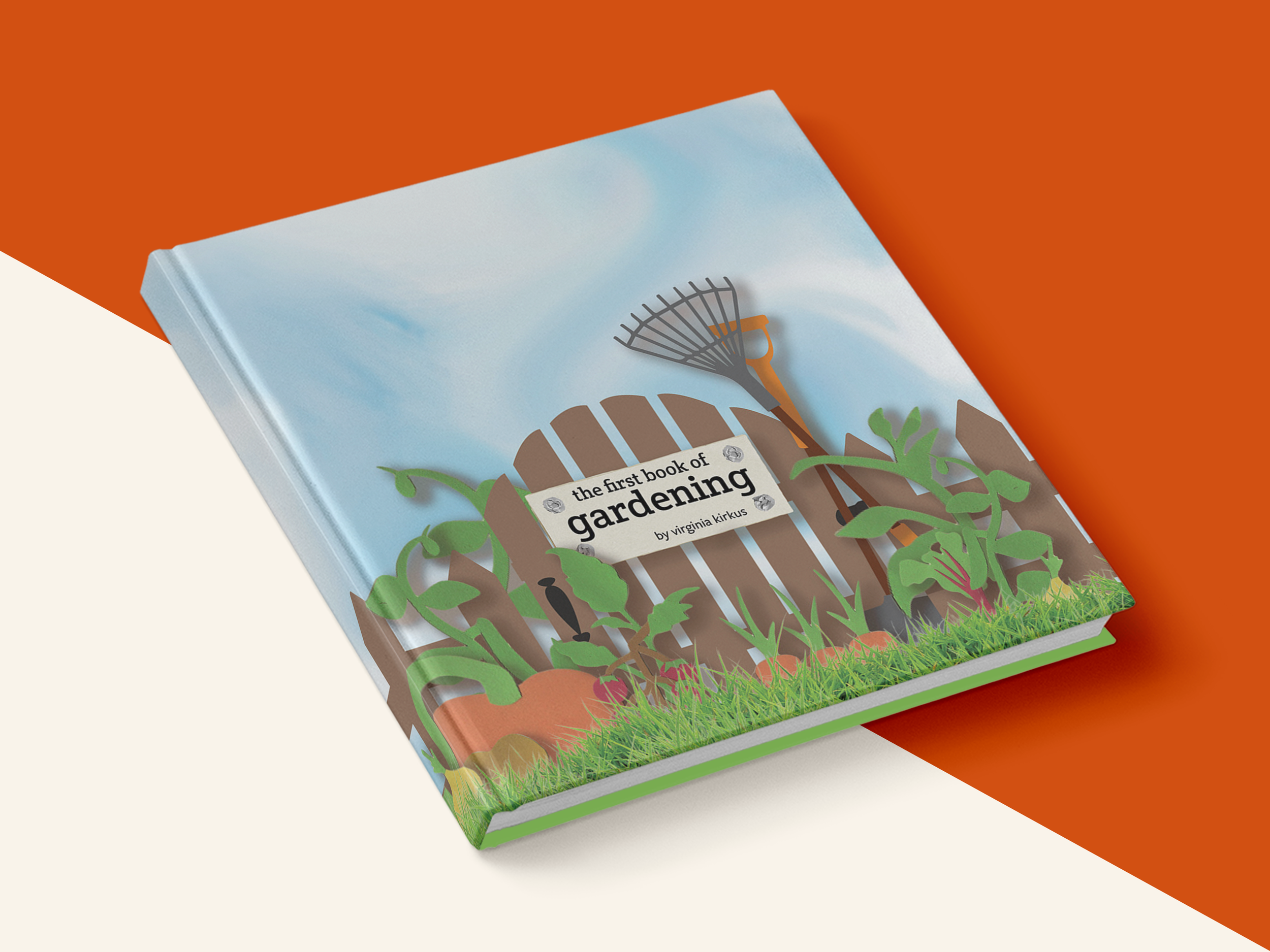
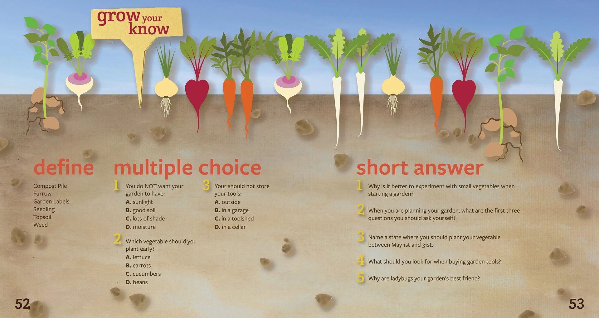
A fully redesigned, kid-centered illustrated book featuring:
Bold, colorful, multi-medium illustrations that celebrate nature and spark curiosity
Modern typography that improves accessibility and enhances readability
Playful layouts that mirror the exploration and creativity at the heart of gardening
A cohesive visual system that reflects the tactile, hands-on spirit of outdoor learning
The result transforms a dated educational book into an immersive, delightful reading experience.
-
A fully illustrated, redesigned publication that resonates with modern children
Increased visual engagement through color, texture, and interactive-feeling layouts
A refreshed identity for a classic book that aligns with current best practices in children’s education and design
Positive feedback highlighting the book’s approachability, charm, and ability to hold a young reader’s attention
-
This redesign deepened my understanding of how illustration, typography, and layout shape accessibility in children’s media. Combining analog and digital illustration techniques allowed me to build a tactile, layered visual world that feels alive on the page. If I were to continue evolving this project, I would experiment with interactive elements, such as flaps, textures, or digital extensions, to further connect kids to the sensory experience of gardening. Overall, this project reaffirmed my belief that thoughtful visual design can make education not just informative, but joyful and kid-centered.